
PROJECT INTRODUCTION
For this project, I worked with Vanguard Investments to redesign their "Digital Advisor Year in Review" feature to be more accessible for users age 50+. During the design process, I conducted a usability test, created a persona, and participated in various design thinking activities, such as card sorting. At the end of the semester, I gave a three-minute pitch of my design ideas to Vanguard representatives.
Research and Foundations:
USABILITY TESTING
The first step in the research process behind this project was to conduct a usability test. I worked with a small group to create questions and tasks to be completed during the test, then conducted a usability test of the original Vanguard prototype over Zoom. Afterward, I rejoined my group to create the usability test report shown to the left.
The test showed us common areas of confusion, as well as areas that received positive feedback.
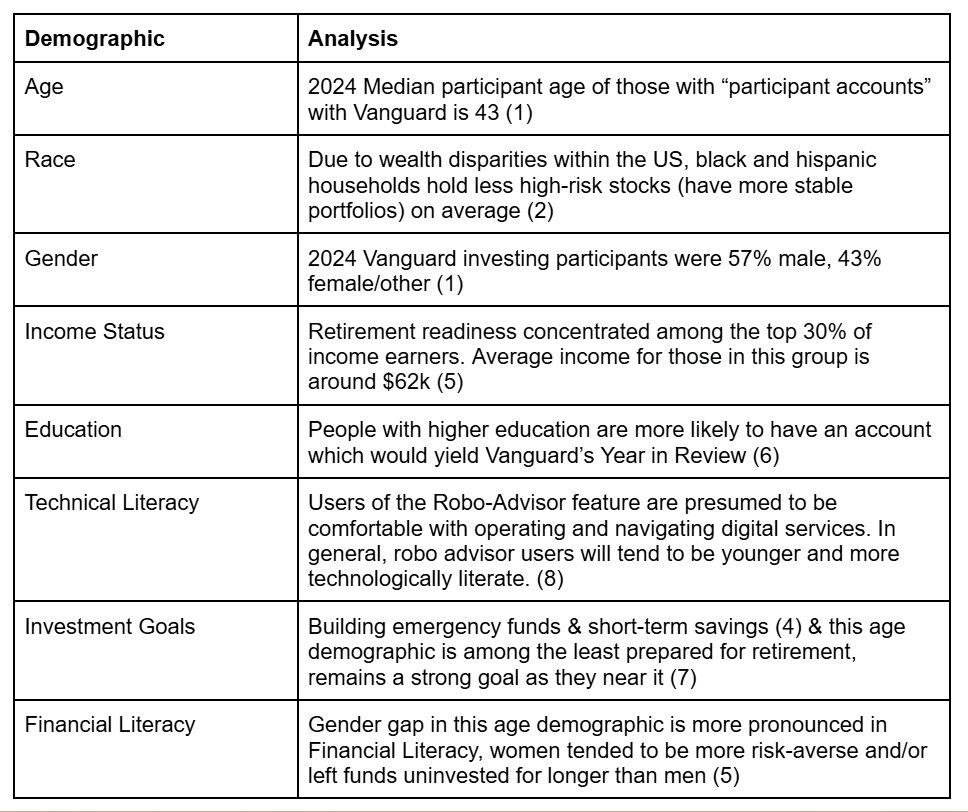
AUDIENCE ANALYSIS
In order to better understand the audience I was designing for, I worked with my group to analyze Vanguard's audience demographics, and create the chart shown here.
Creating this chart helped me understand who the users of Vanguard's Digital Advisor feature are according to their own data.
PERSONAS
I then worked with the same group to create three personas that could fit a user of Vanguard's Digital Advisor feature. After we created those personas, I selected one of them to develop further. The persona I chose involved a user who has limited technological experience and is hesitant to trust digital investing services. From this persona, I created a persona poster and an empathy map, both shown below.
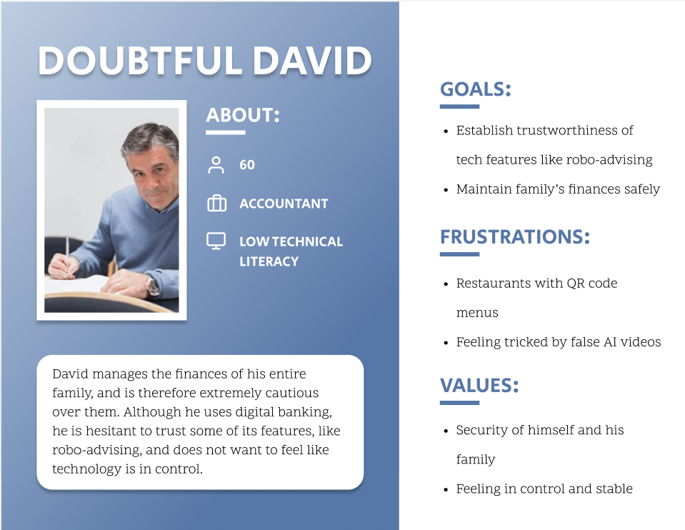
Persona poster
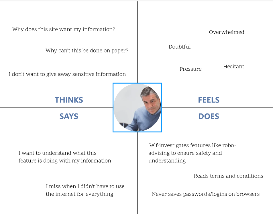
Empathy map
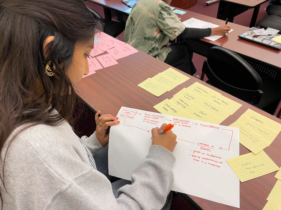
CARD SORT ACTIVITY
The last step in the research process was to participate in a card sorting activity. For this activity, I worked with a partner to sort cards that contained components from Vanguard's Year in Review prototype into categories that felt natural.
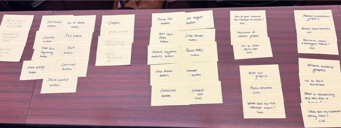
From the sorted cards, I then created a structure diagram to organize the layout of the screens, which I used as a blueprint as I continued the design process.
Design Work:
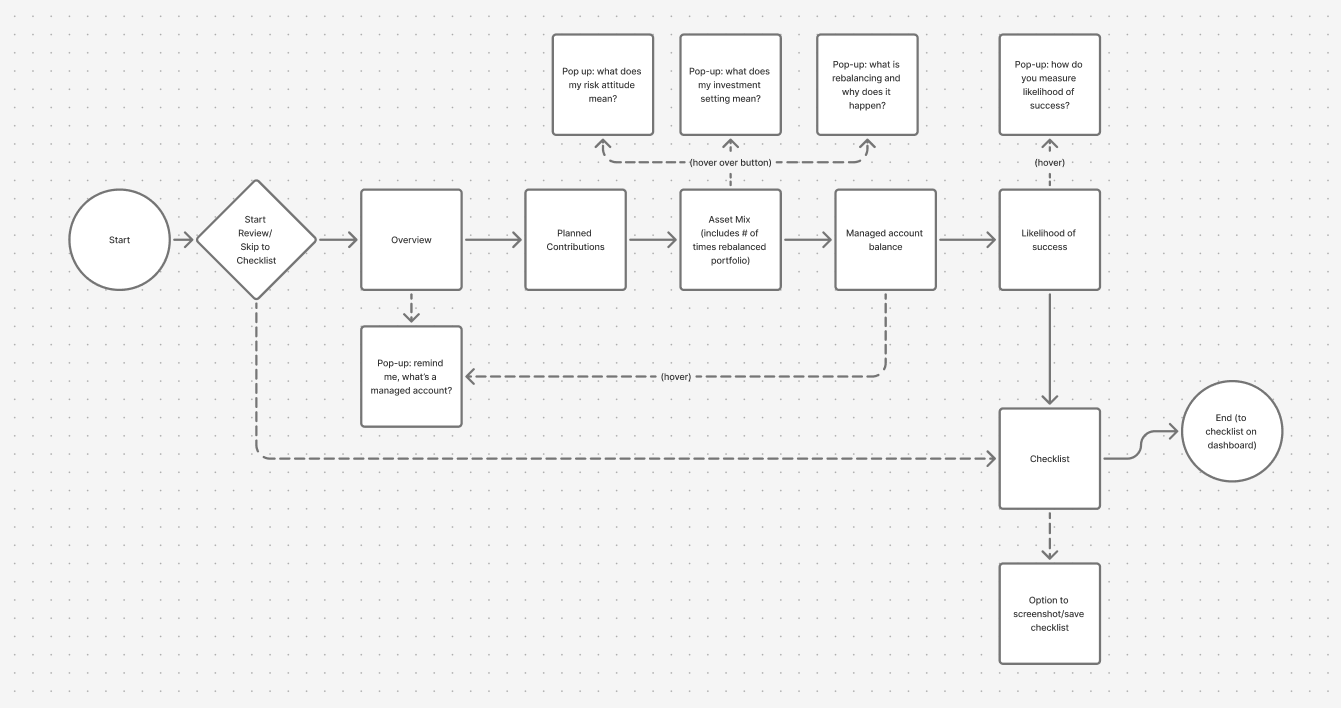
STRUCTURE DIAGRAM
Using the structure diagram I drew above, I created a flow diagram in Figma that better represented the actions a user would take as they navigate the website. This diagram showed me how to organize my frames as I began to work on my design in Figma.
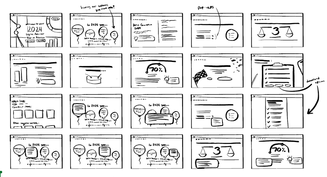
WIREFRAMES
From the flow diagram, I sketched out ideas for what each screen would look like (shown to the right). I then recreated these sketches in Figma as wireframes to better visualize the design on a screen.
Some things I considered when thinking of ideas were how to emphasize clarity and transparency in information, and how to follow the emotional response of the user. My wireframes in Figma are linked below.
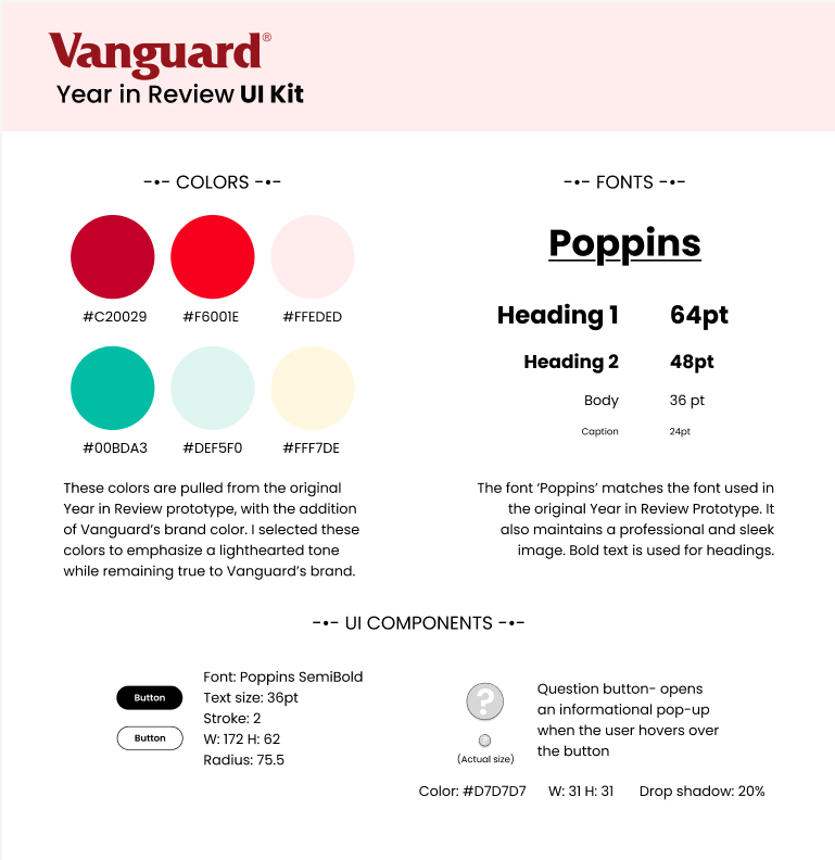
UI KIT/STYLE GUIDE
The next step in the design process was to create a UI kit that would guide my color decisions in my design. The colors I chose were taken directly from the original Vanguard Year in Review prototype, with the addition of the Vanguard brand color. I chose these colors to best fit Vanguard's brand identity, and to emphasize a lighthearted tone.
The font I chose to use throughout the design was "Poppins", because of the similarity it has to the font used in Vanguard's original prototype. This font fits Vanguard's brand and has a professional and sleek image.
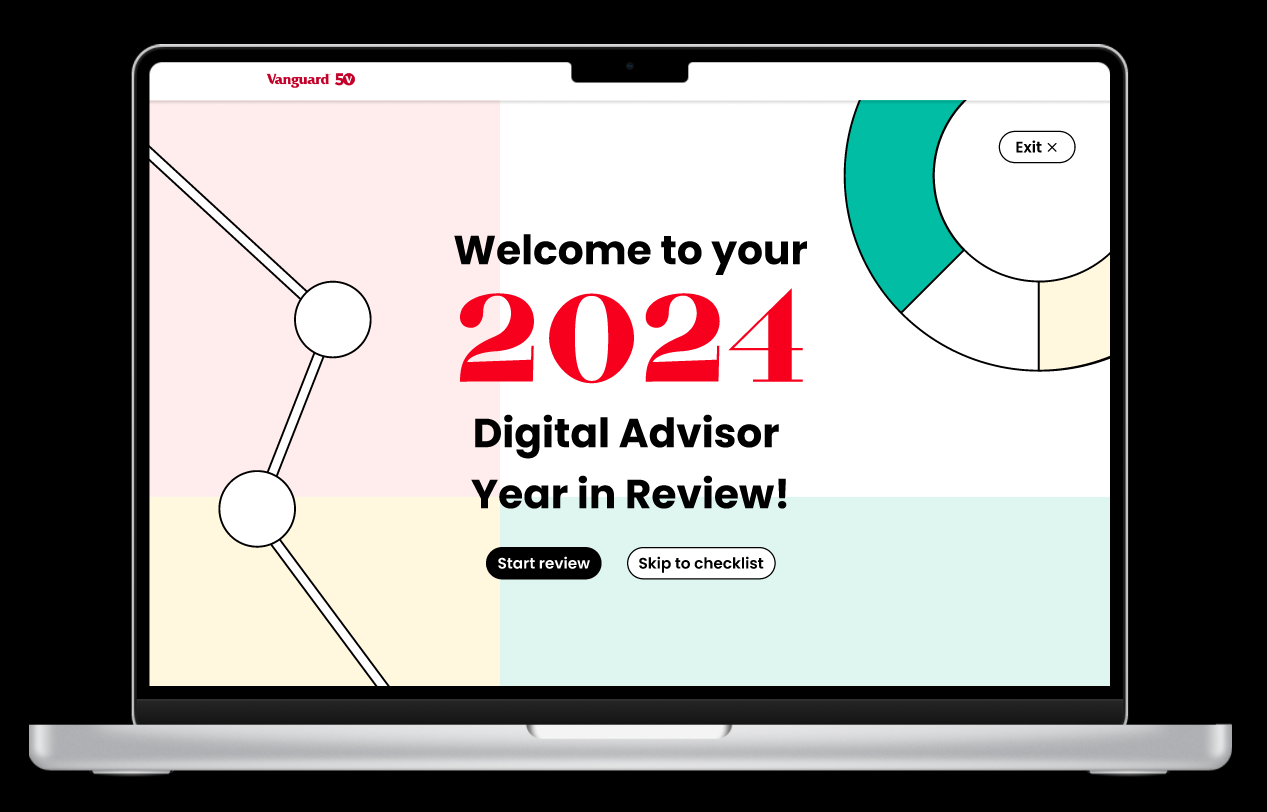
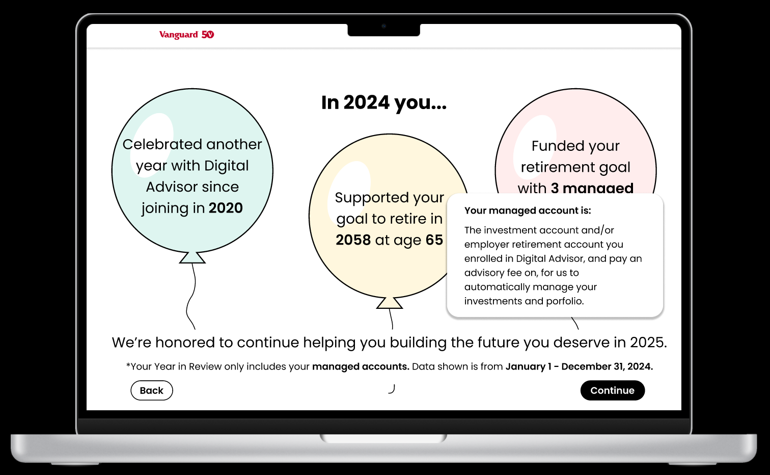
HI-FIDELITY MOCKUPS
When creating my final prototype, my main goal was to add features that help the user understand the information being given to them, while upholding a lighthearted and fun feel. To do this, I made the informational pop-up boxes easier to access, added more graphics and integrated them into the text, and adjusted the navigation to provide direction and advice every time a user receives a piece of information.
Here are some screenshots of my prototype as well as a link to the full prototype:
THE PITCH
Lastly, I pitched my design ideas to Vanguard representatives in a three-minute presentation. The slides I used to present my ideas are linked to the right: